
Tailwind Crash Course - Project Based Learning
Padding & Margin
CSS has two primary ways to add some white space with margin & padding. Margins are outside of the element and paddings are inside of the element.
Now, let’s take a look again at the numbering system that we already learned about and we need to reuse it in different places while using Tailwind CSS.
|
Sizes |
|
|
0, 1, 2, 3, 4, 5, 6, 32, 40, 48, 56, 64 |
+1 +2 +4 +8 |
Numbering system for padding and margin is exactly the same as it was for height and width. For example, if you need a padding of 16px then it will simply be 4rem in Tailwind. Here is the syntax:
.{p|m}-{size}
p as padding & m as margin followed by - and then the size.
Let’s code something.
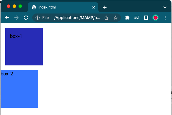
Let’s add two divs and give them background colors and also give some height and width to make it look bigger and square in shape. I will be using blue shades again and height and weight of 128px which will be 32rem in TailwindCSS.
<div class=“bg-blue-800 h-32 w-32”>box-1</div>
<div class=“bg-blue-500 h-32 w-32”>box-2</div>
After adding these two div in our body, result will be something like:

Now we will add some margin and padding. Like we mentioned above, margins separate something from the outside and padding is for inside. So if we add some margin to the box-1, that should separate two boxes and with the use of padding, it should add some space inside. Now let’s add some margin & padding to the box-1 using .m-4 and .p-4
<div class=“bg-blue-800 h-32 w-32 m-4 p-4”>box-1</div>   // adding class m-4 to add 16px margin
<div class=“bg-blue-500 h-32 w-32”>box-2</div>
Refresh your web page and see the result. It should be as below:
🛑 You can see in the result that it has added a 16px margin on the outside of box-1 and 16px padding inside of the box-1. But we don’t really have any control because this is adding margin & padding everywhere (all four sides of the box).
What If we want to add margin & padding only to the bottom or to the top 🤔? Alright, let’s take a look at how we make that happen. For that we have another formula but with the same numbering system.
.{p|m{l|r|t|b}}-{size}
We have 4 new parameters {l|r|t|b} to add in .{p|m}-{size} formula to take control on margin and padding. Using these parameters we can give margin or padding wherever we need it.
lis for leftris for righttis for topbis for bold
|
Sizes |
|
|
0, 1, 2, 3, 4, 5, 6, 32, 40, 48, 56, 64 |
+1 +2 +4 +8 |
With these new modifiers, if we only want to add the margin on the bottom and padding on the left, we will use .mb-4 and .pl-4. We can also use a different number. Like ml-8 and mb-5
Code example:
<div class="bg-blue-800 h-32 w-32 mt-4 mb-4 pl-2">box-1</div>
💡 In the previous code example, we used two different classes to add same number of margin on the top and the bottom “mt-4 mb-4”.
There is a shortcut for this or we can call another version of adding margin and padding which is as below:
.{p|m{x|y}}-{size}
|
Sizes |
|
|
0, 1, 2, 3, 4, 5, 6, 32, 40, 48, 56, 64 |
+1 +2 +4 +8 |
Here we have x and y. We can call these as x access & y access.
xaccess means left and right.yaccess means top and bottom.
So we can simplify this, mt-4 mb-4 with simply my-4. There will be no different in result but only save a little bit of typing 🤪
Code example:
<div class="bg-blue-800 h-32 w-32 my-4 pl-2">box-1</div>So, that’s how our margins and paddings works.
