
Tailwind Crash Course - Project Based Learning
Flexbox Directions (rows and cols)
Now Let’s change it quite a bit. Let’s go back to our first example so we can talk about Flexbox direction .flex-{direction}.
If you remember we had an example when we turned on flex, all of the boxes they just got next to each other:
<div class="h-screen flex">
            <div class="bg-yellow-600 w-16 h-16">1</div>
            <div class="bg-teal-700 w-16 h-16">2</div>
            <div class="bg-red-700 w-16 h-16">3</div>
</div>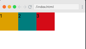
But you can change the direction of flex. Meaning, we are flexing in the horizontal direction. We can also call row to horizontal direction. Refer to the table below for more information on it:
| Directions | |
| row row-reverse col col-reverse |
As you can see, we have 4 different ways to give direction to our Flexbox. But row is default.
.flex-row means we are flexing on the row direction. Row direction is just default. |
.flex-row-reverse with that we can reverse the entire row. Let’s try this. |
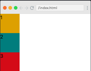
We will be adding .flex-row-reverse to our main/container div.
<div class="h-screen flex flex-row-reverse">      <!-- we just added .flex-row-reverse here-->
            <div class="bg-yellow-600 w-16 h-16">1</div>
            <div class="bg-teal-700 w-16 h-16">2</div>
            <div class="bg-red-700 w-16 h-16">3</div>
</div>
Here is the result

We can also try with .flex-col and .flex-col-reverse direction. Col represent to the vertical direction. Let’s try this.
<div class="h-screen flex flex-col">   <!--we just added .flex-col here-->
            <div class="bg-yellow-600 w-16 h-16">1</div>
            <div class="bg-teal-700 w-16 h-16">2</div>
            <div class="bg-red-700 w-16 h-16">3</div>
</div>
See the results:
And we can also reverse this by simply using .flex-col-reverse instead .flex-col. Try it yourself.
Now let’s try adding some alignments to these boxes. If you remember, we have .items-{alignment} and .justify-{alignment}. Let’s use these both with flexbox.
<div class="h-screen flex flex-col justify-center items-center">
            <div class="bg-yellow-600 w-16 h-16">1</div>
            <div class="bg-teal-700 w-16 h-16">2</div>
            <div class="bg-red-700 w-16 h-16">3</div>
</div>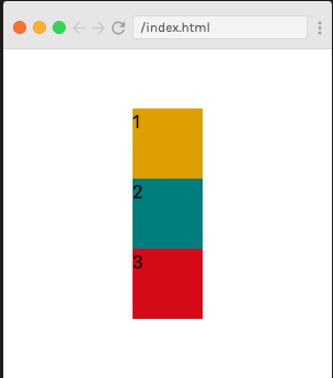
We will recap on this because this is an important concept of the flexbox. Whenever you flip the direction of your flexbox, you are also flipping the direction of both the horizontal alignments and the vertical alignments. So, just to fine alignment, its horizontal only and only if flex is in the row direction. If flex is in the column direction, then in that case justify is talking about vertical alignments.
In .items-{alignment}, it is the vertical alignment as long as flex is in row direction otherwise its horizontal in col direction.
